Typography Posters
Spring 2026
Objective
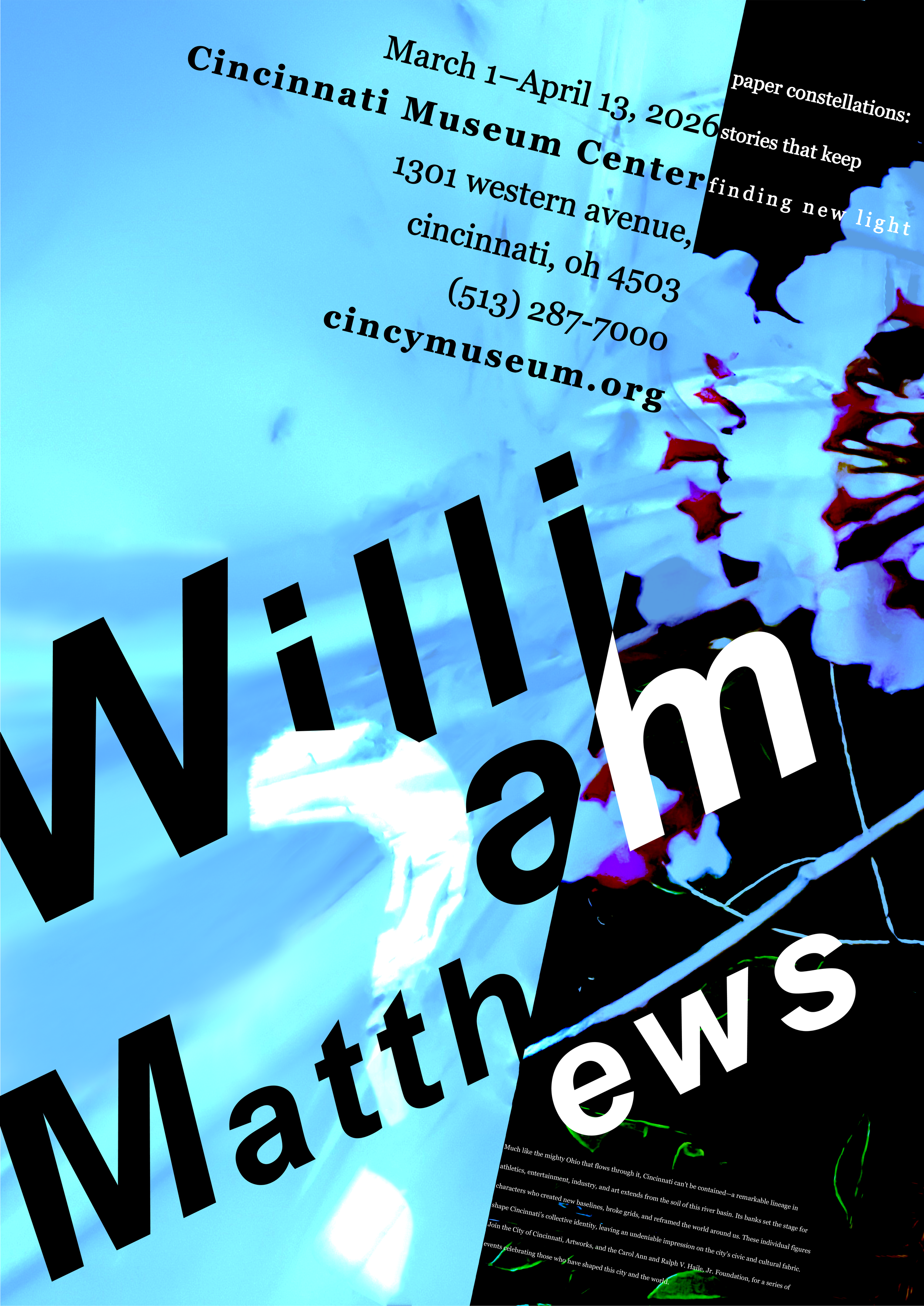
To create a visually compelling poster centered on the poet William Matthews, drawing attention to his poetry and its themes of life and death, human consciousness, and the passage of time through the use of expressive typography, grid systems, and photography. By translating poetry into a visual experience, the project explores how design can help people connect with one another, interpret shared human experiences, and navigate life's complexities as a community.
Why?
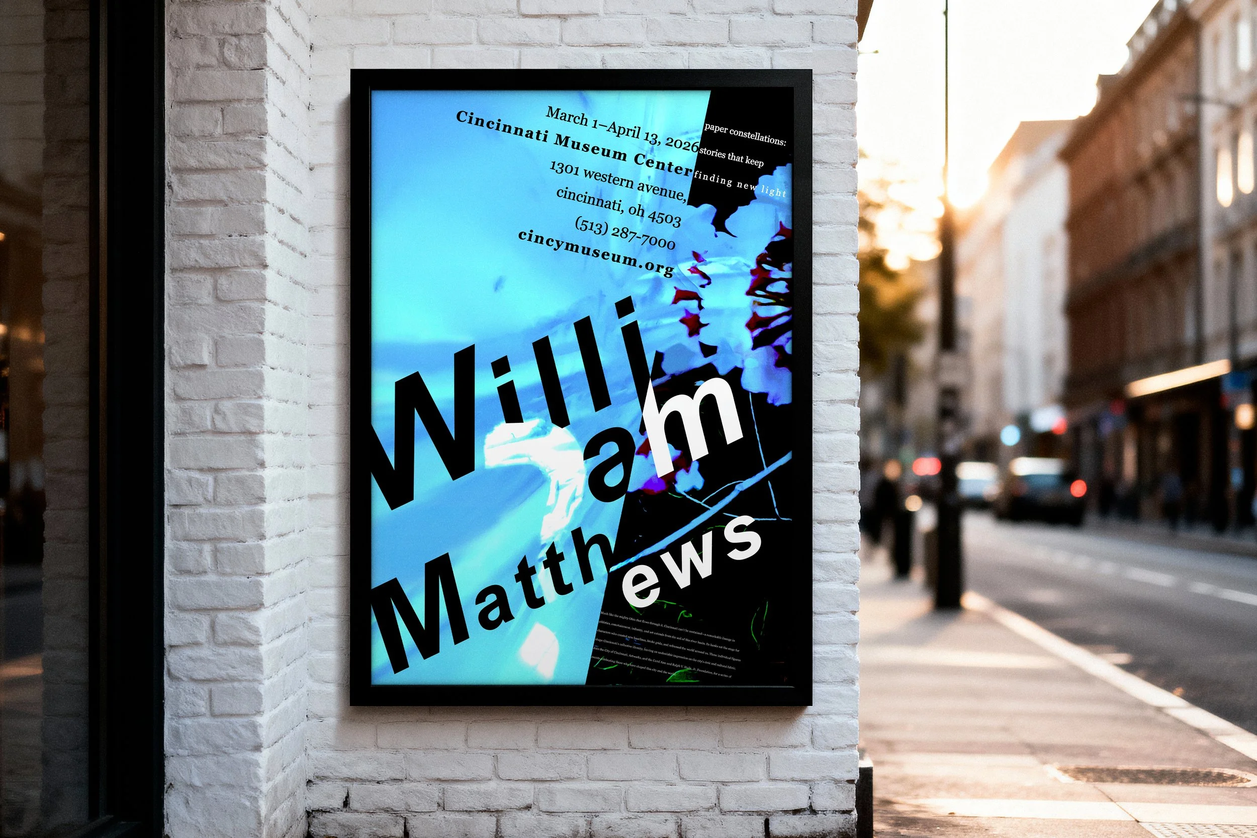
This poster was designed to reflect the fragility of life and explore the complexities of human consciousness through the poetry of William Matthews. By drawing viewers into the themes and emotions woven throughout his poems, the poster encourages audiences to explore the depth and meaning of Matthews' words. It serves as both a tribute to his work and an invitation to engage with the often unseen aspects of the human experience.
Who?
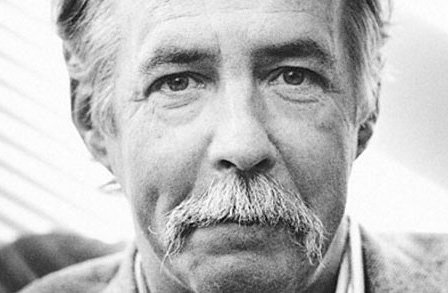
William Matthews was an American poet known for his conversational style, wit, and thoughtful exploration of everyday life. His poetry often reflects on themes such as love, mortality, memory, music, and human consciousness, blending humor with emotional depth. Throughout his career, Matthews published numerous acclaimed collections and earned a reputation for making complex emotions feel personal and accessible. His work continues to be celebrated for its honesty, intelligence, and ability to find meaning in ordinary moments.
Experimental Play/Direction Studies
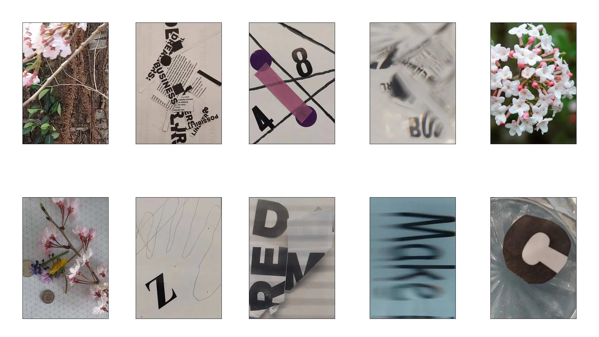
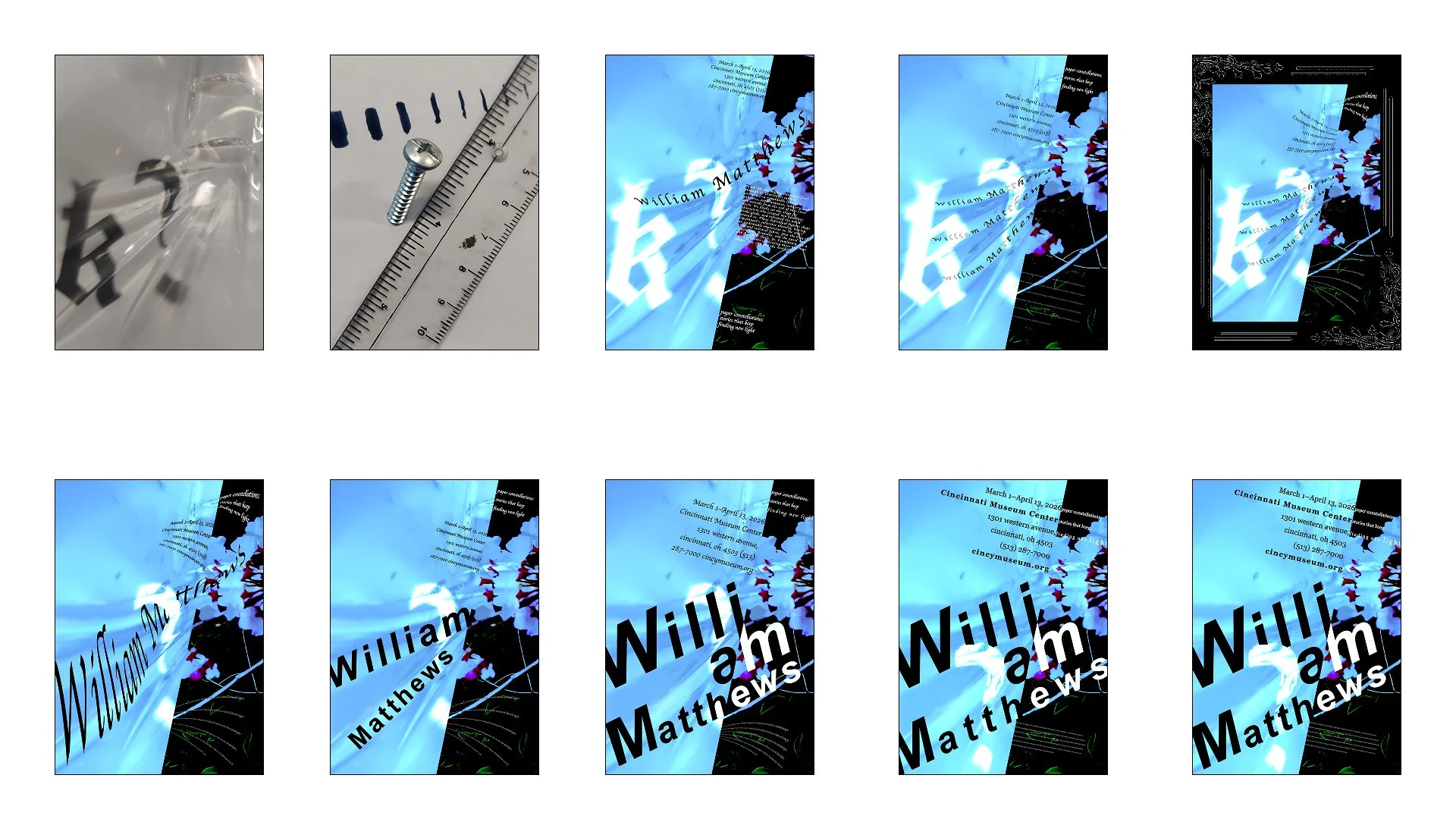
I began by cutting, distorting, and arranging printed words and letters to explore how they interacted visually. Through this process, I discovered that I was drawn to the distorted letterforms and the sense of randomness they created. I also appreciated the clear separation between the visual elements because it reflected the contrasting themes of life and death that are present throughout William Matthews' poetry. As I continued experimenting, I found that overlaying photographs with text created a compelling visual effect. This led me to choose the image of the flower layered over the typographic composition. The flower became a symbol of life, while the surrounding black section, found in later refinements, represented death. The hands-on process of cutting, distorting, and arranging printed materials helped me identify which visual ideas felt the most powerful and which ones did not effectively reflect the meaning of William Matthews' poetry. These explorations with separation, contrast, and layered imagery ultimately guided my refinements and led to the development of my final poster design.
Typeface Studies
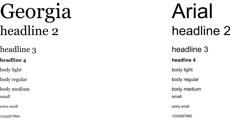
I chose the Georgia and Arial typefaces for their readability and strong visual presence. Arial was used for the main focus of the poster because its clean, bold letterforms create a clear visual hierarchy and immediately draw the viewer's attention. Georgia was selected for the supporting text because its serif design enhances readability while adding a more refined and literary feel that complements the subject matter of William Matthews' poetry.
Final Typefaces:
Color Studies
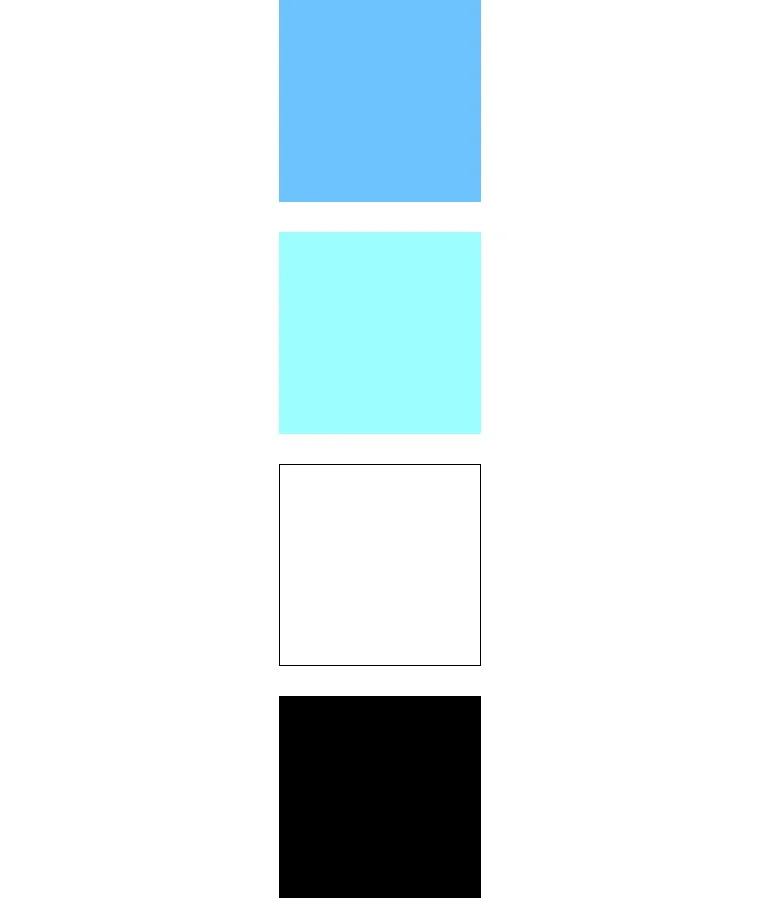
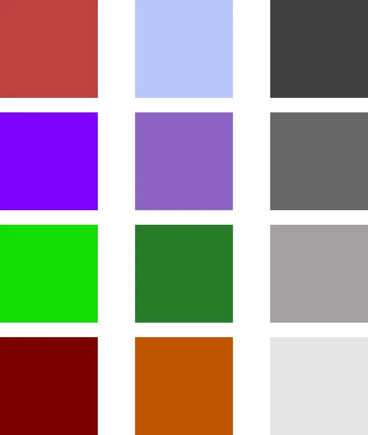
I explored a variety of color palettes throughout the design process, experimenting with reds, purples, grays, and greens before settling on a final selection of white, black, sky blue, and light aqua. I chose the shades of blue because they evoke melancholy, often associated with the phrase "feeling blue." These colors reflect the more introspective and emotional aspects of the human experience, themes that are explored in William Matthews' poetry. White and black were chosen to create a clear visual contrast between life and death, reinforcing one of the central ideas of his work and elevating the shout, talk, and whispers of my poster.
Final Colors:
Color Studies:
Final