Flight Information Display System
Spring 2026
Objective
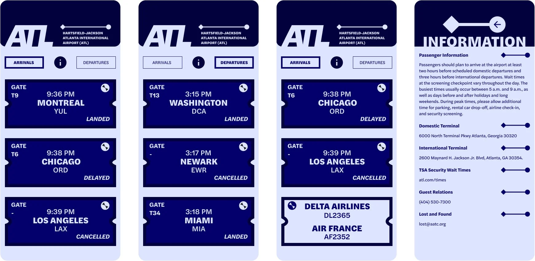
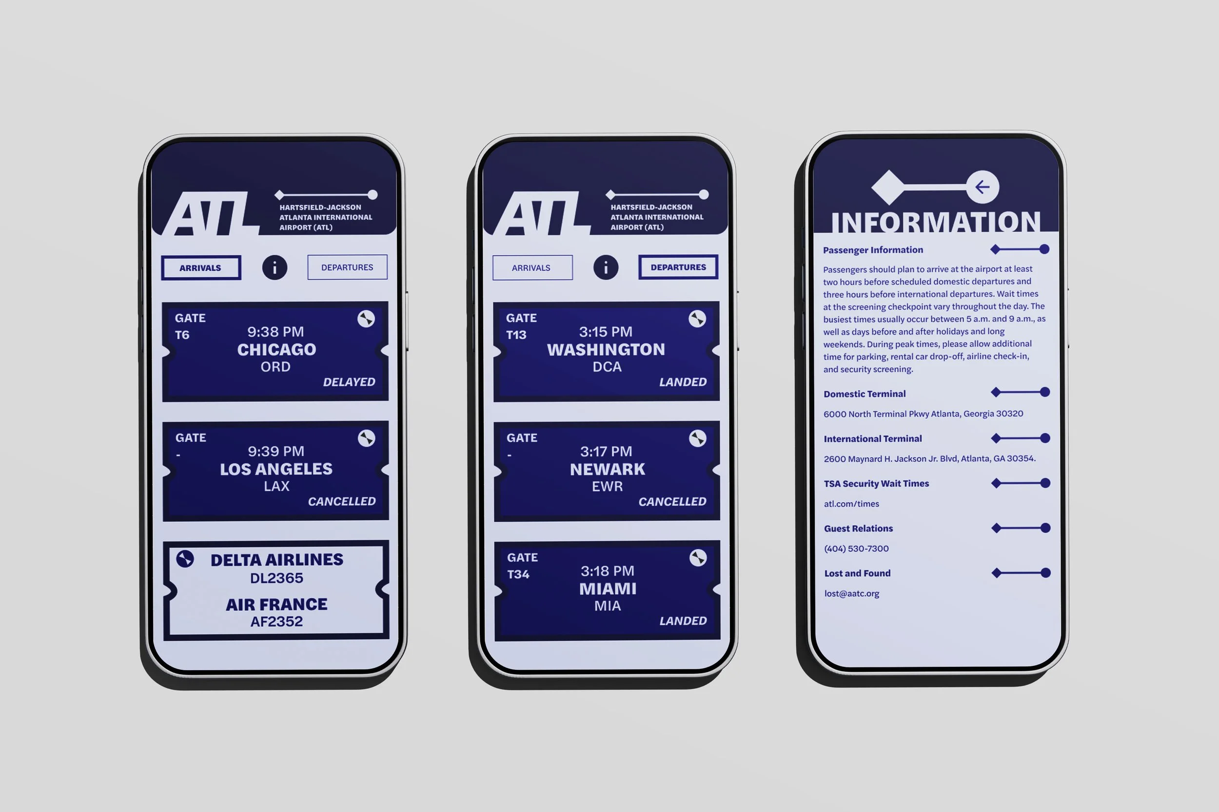
To design a clean, easy-to-read FIDS (flight information display system) for mobile phones. The app focuses on legibility, accessibility, and wayfinding to guide new and experienced users through the stress of airport travel.
Typeface Studies
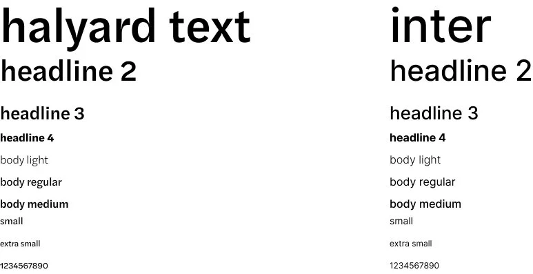
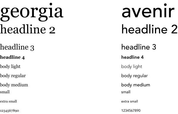
I explored several typefaces: Inter, Halyard Text, Georgia, and Avenir, to find the right balance between legibility and a bold look. I chose to include two typefaces: Inter and Halyard Text. I chose Inter for a bold logo and Halyard Text for its readability and strong structure. Halyard Text is beautifully robust and lively, which make it perfect for an app where users need to quickly scan flight details.
Final Typefaces:
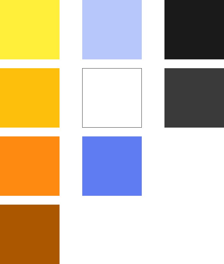
Final Colors:

Typeface Studies:
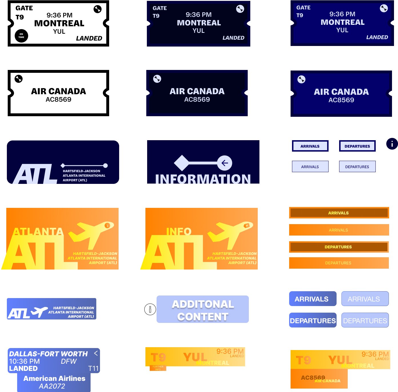
Direction Studies
I examined various ways to organize and design flight information so that the most important details like departure times, gates, flight status, and information tabs stand out first. I tried various design layouts and styles to see what allowed users to comprehend flight information in the best way possible.
Color Studies
The goal was to find a color palette that stood out to users, while also allowing the viewer to understand and process the information in front of them at a fast rate. I landed on a mix of blue, light blue, dark blue, and midnight blue. The various tones of blue are meant to guide the eye, keep the design grounded, and easy to read.
Color Studies:
Final