Interpretive Haiku
Spring 2026
Objective
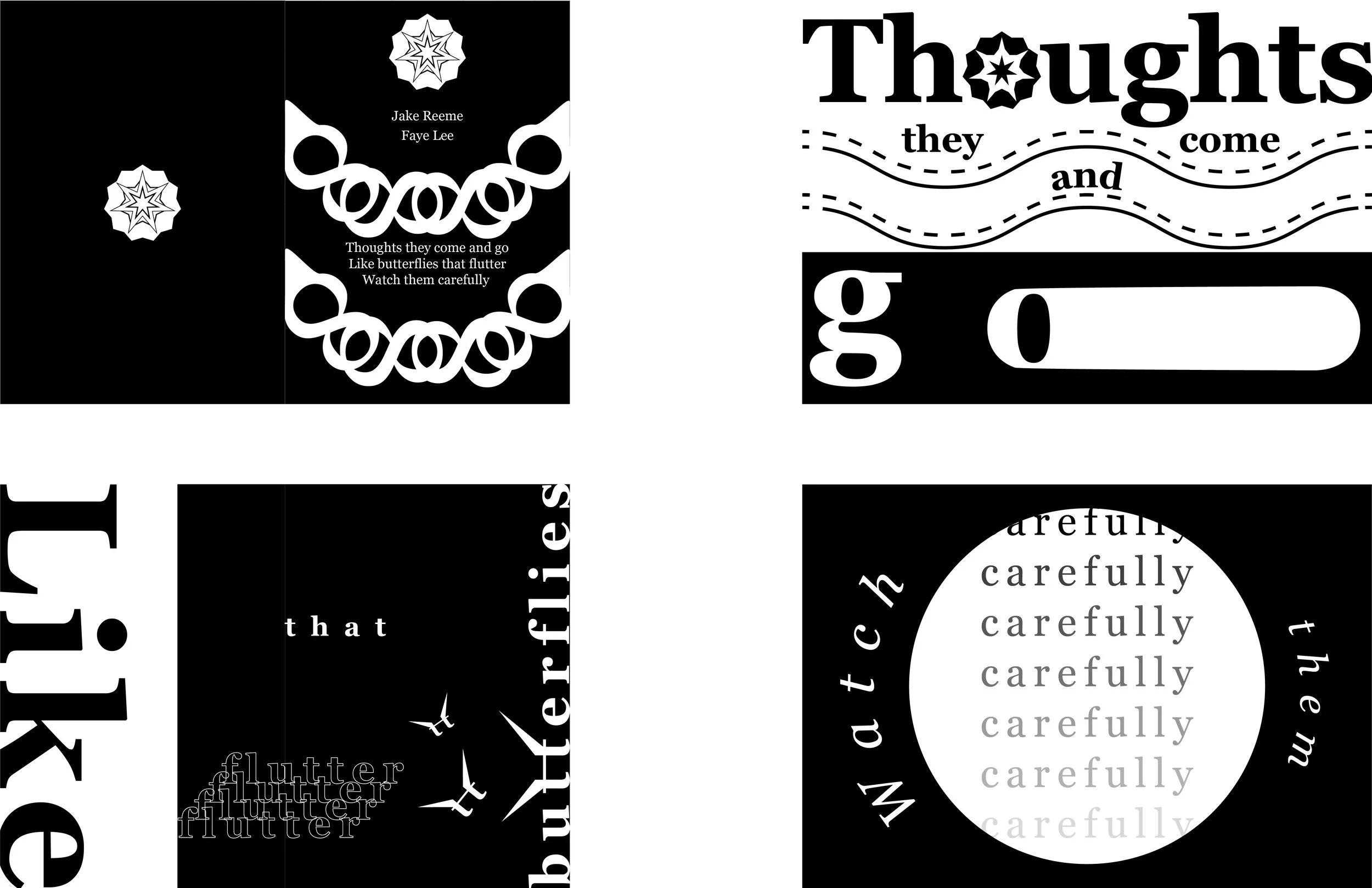
To create an interpretive haiku design using a traditional three-line haiku poem, structured according to the proportions of a Root 2 rectangle.
Typeface Studies
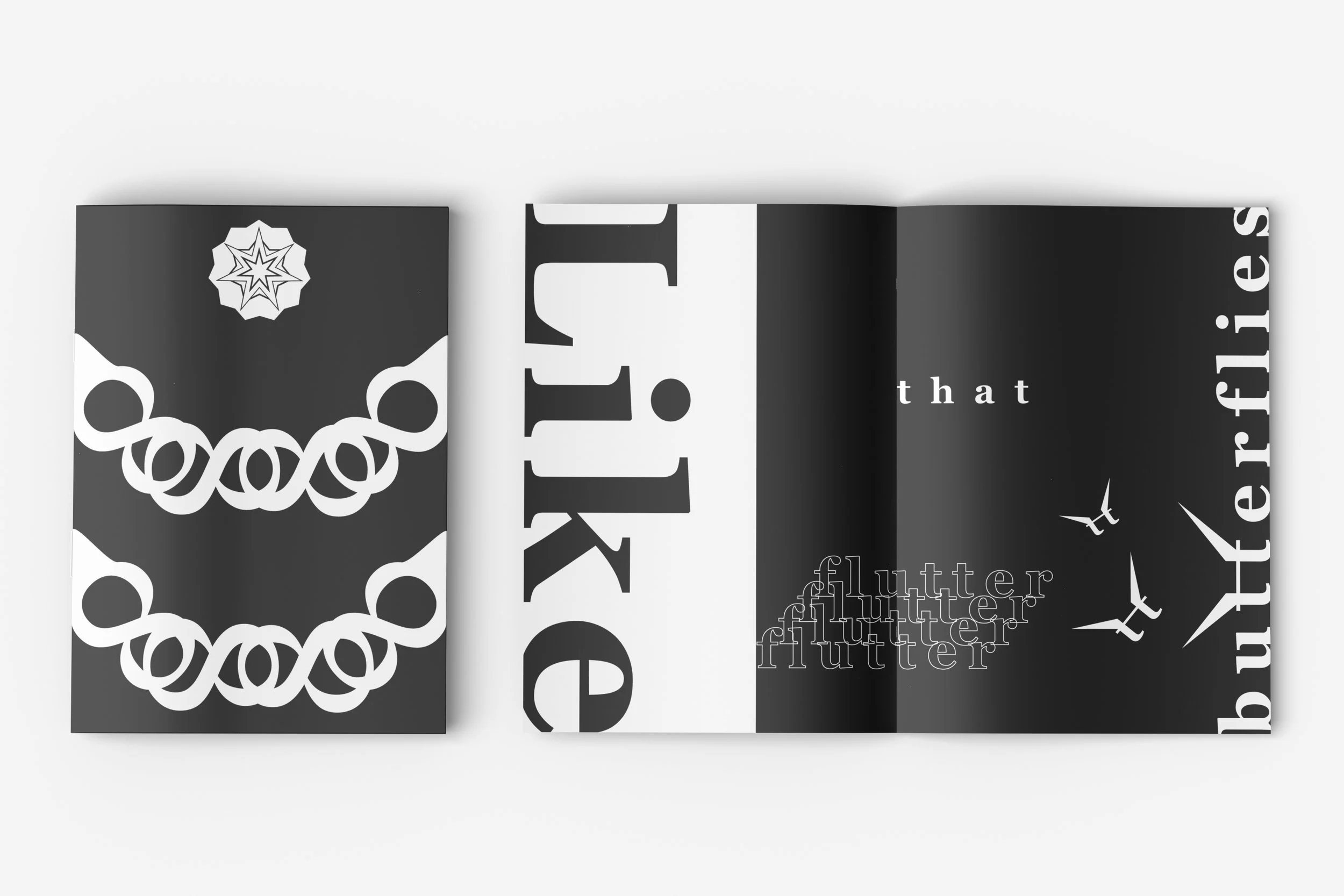
I chose the Georgia typeface for its clear legibility on digital screens. I felt that strong readability was especially important for a design focused on interpreting the meaning of the poem, as it allows viewers to easily engage with both the text and its visual interpretation.
Final Typefaces:
Direction Studies
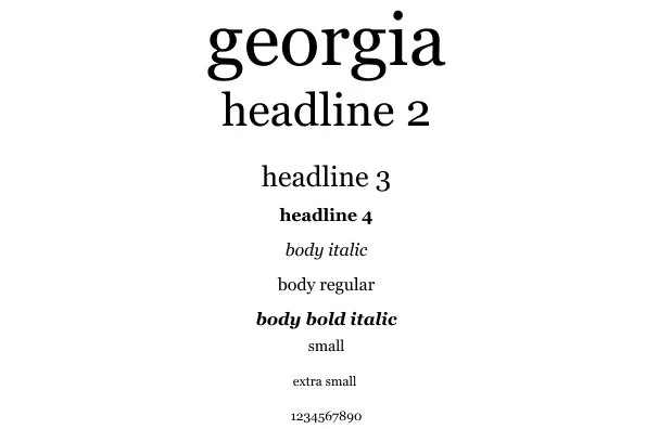
The design consists of a front cover, back cover, and three spreads. My early designs for the front and back covers remained relatively unchanged, as the back cover only needed to include the poem and the poet's name. The main changes occurred within the spreads as I began to realize that I was interpreting the poem too literally rather than figuratively. For example, instead of using a train to represent the movement of thoughts in the poem, I explored using the word itself as a visual element. This realization led me to interpret the poem through symbolism and more abstract, non-literal approaches, ultimately strengthening the overall design.
Haiku
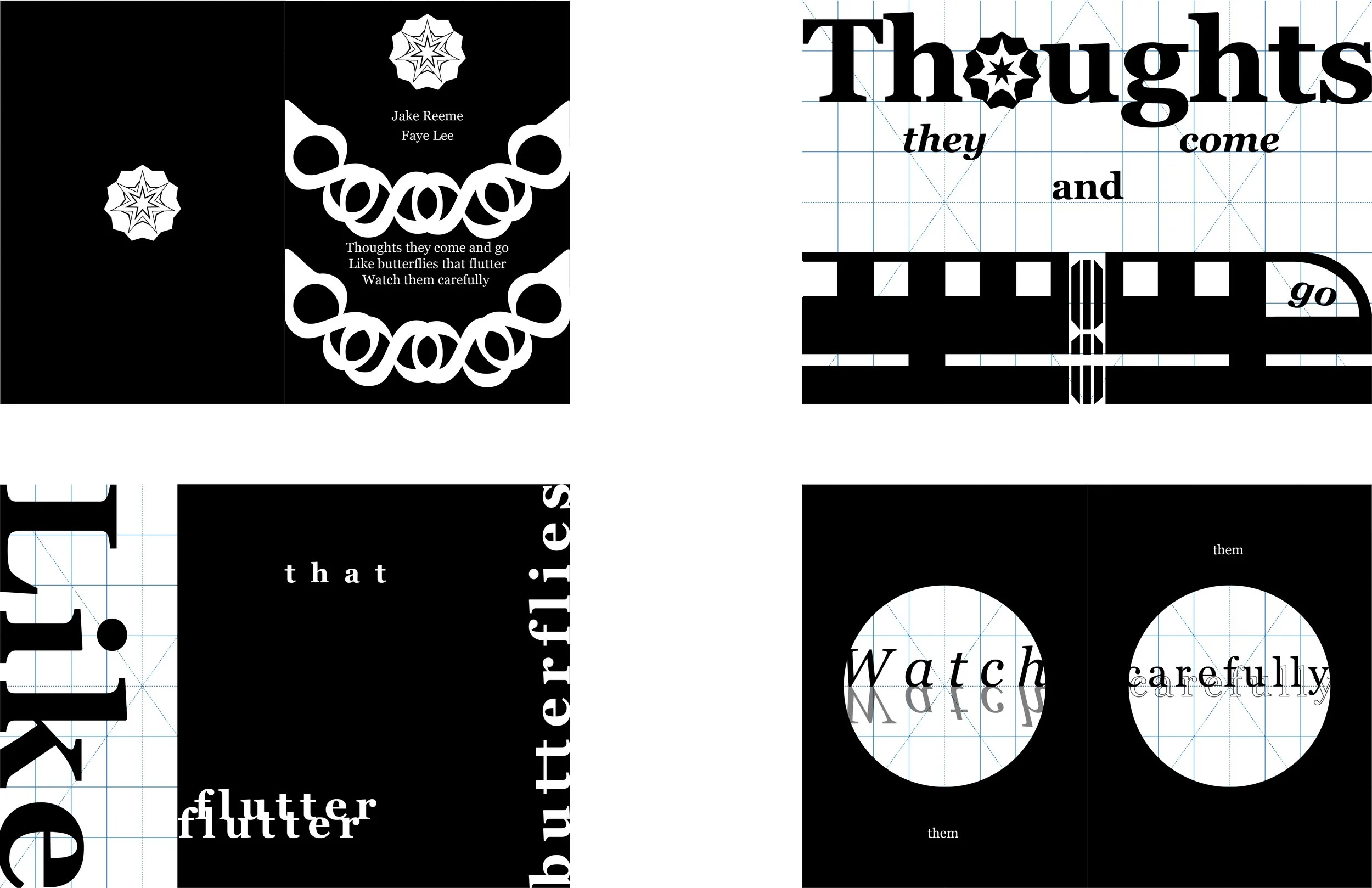
The haiku I chose is “Butterfly Thoughts” by Faye Lee. It follows the traditional 5-7-5 structure and reads, “Thoughts they come and go, Like butterflies that flutter, Watch them carefully.” I chose it because it represents the importance of being mindful of our thoughts, which can become overwhelming like butterflies constantly fluttering around.
Final