Album Cover Redesign
Summer 2026
Objective
To create an alternate cover of an already existing album.
I Let It In and It Took Everything
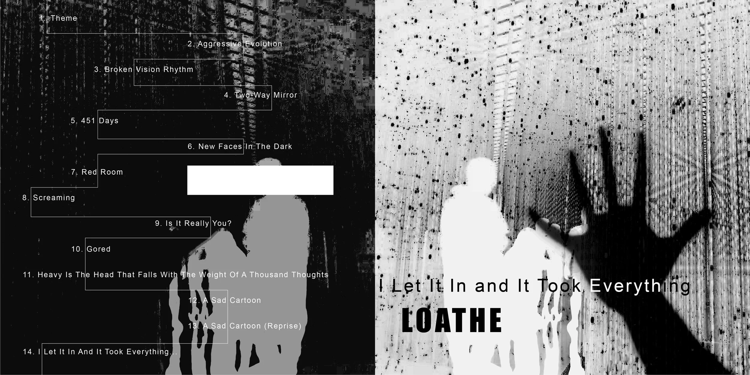
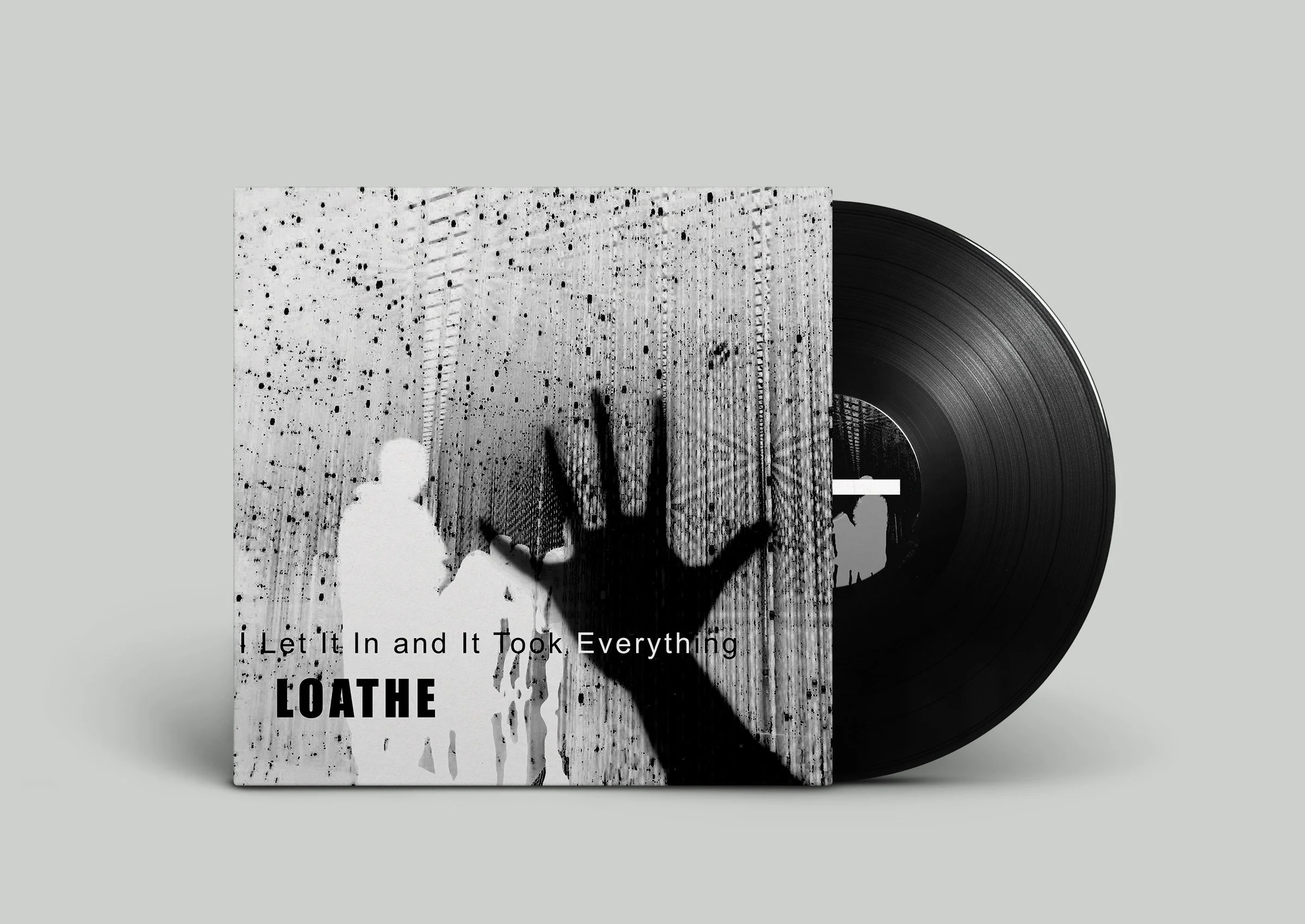
I Let It In and It Took Everything by UK metal band Loathe explores the deconstruction of safety, personal trauma, and internal grief. Throughout the album, the band uses the metaphor of an all-consuming force that infiltrates a person’s life, stripping away everything they hold dear. The record shifts between crushing heaviness and atmospheric, shoegaze-inspired beauty, creating a powerful emotional contrast. This duality is especially evident in the aggression of tracks like “Gored” and the ethereal softness of “Two-Way Mirror” and “Is It Really You?” Together, these contrasting sounds reflect the experience of confronting harsh realities while searching for peace, hope, and intimacy. The album also explores the overwhelming nature of modern life, consumerism, and the chaos of the world.
Research/Photo Studies
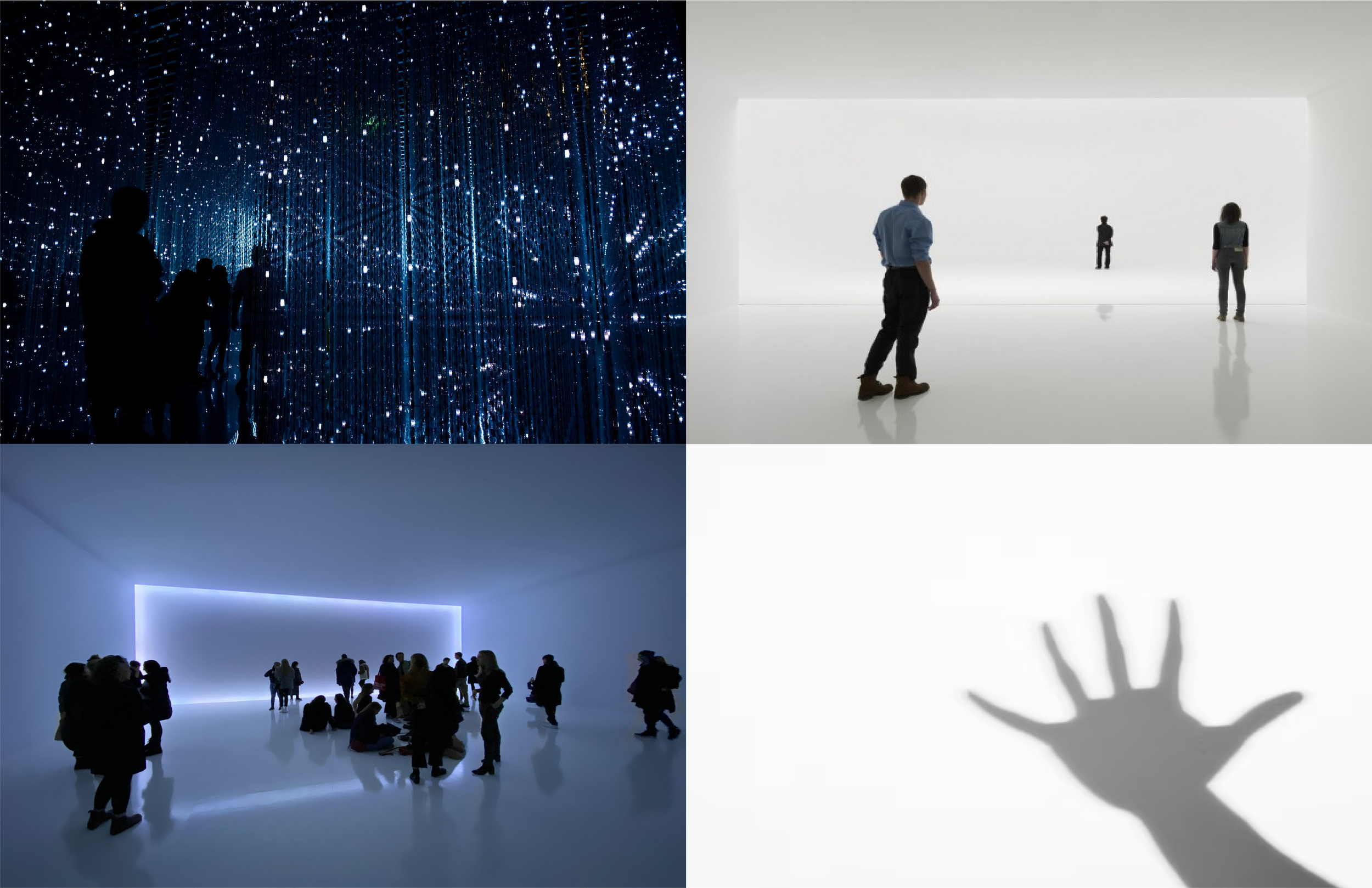
During my research, I found that photographs featuring dark figures in the background and shadowy hands closely reflected the album's themes of personal grief and emotional isolation. The shadowy hand also reinforced the album’s central metaphor of an all-consuming force that infiltrates your life.
Typeface Studies
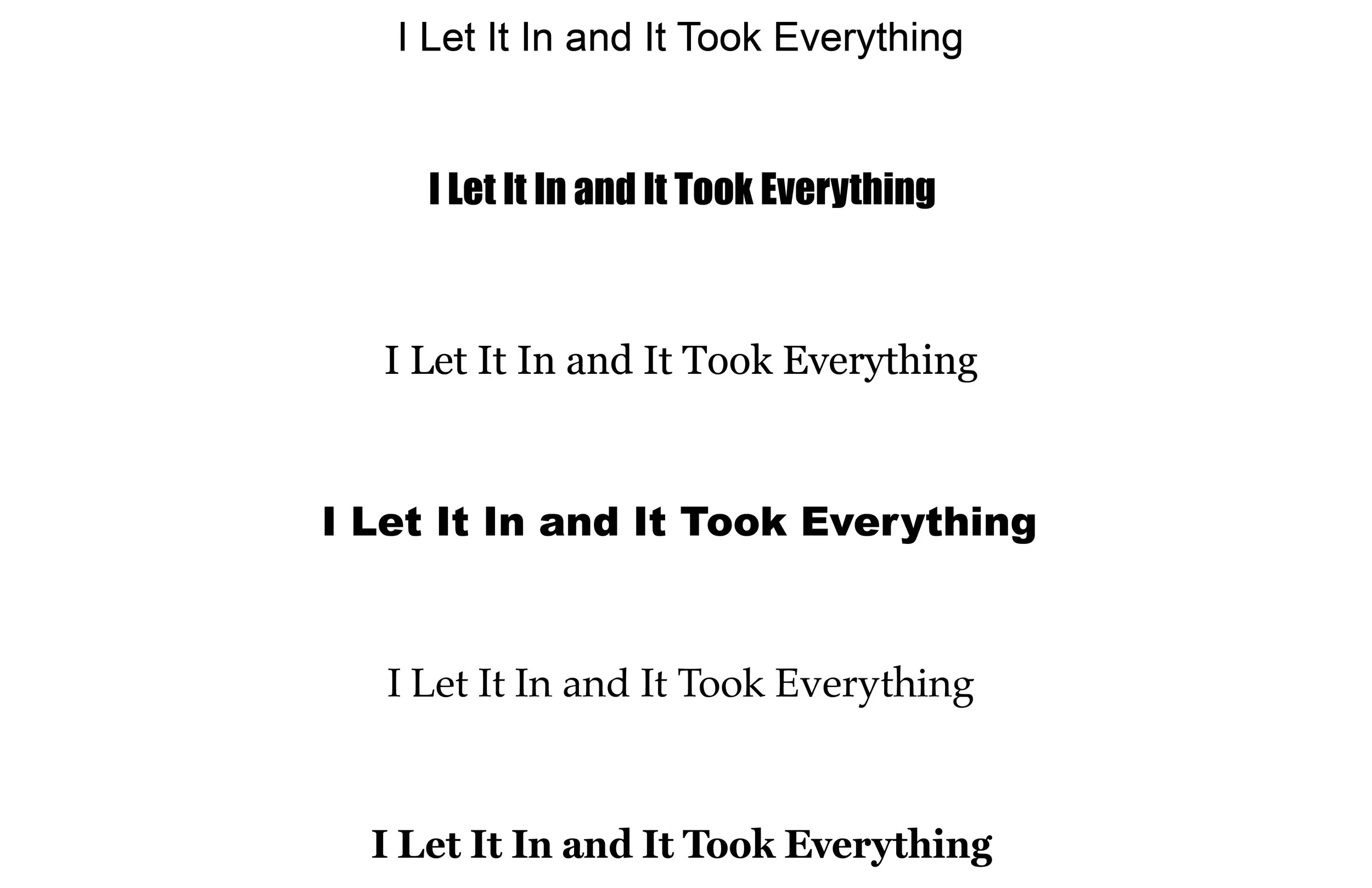
For the typography, I chose a combination of Arial Regular and Impact Regular. Arial Regular was selected for the supporting text because of its clean, simple, and highly readable letterforms, allowing the information to remain clear and accessible. For the band name, I used Impact Regular because its bold, condensed letterforms create a strong visual presence that immediately draws the viewer's attention.
Direction Studies
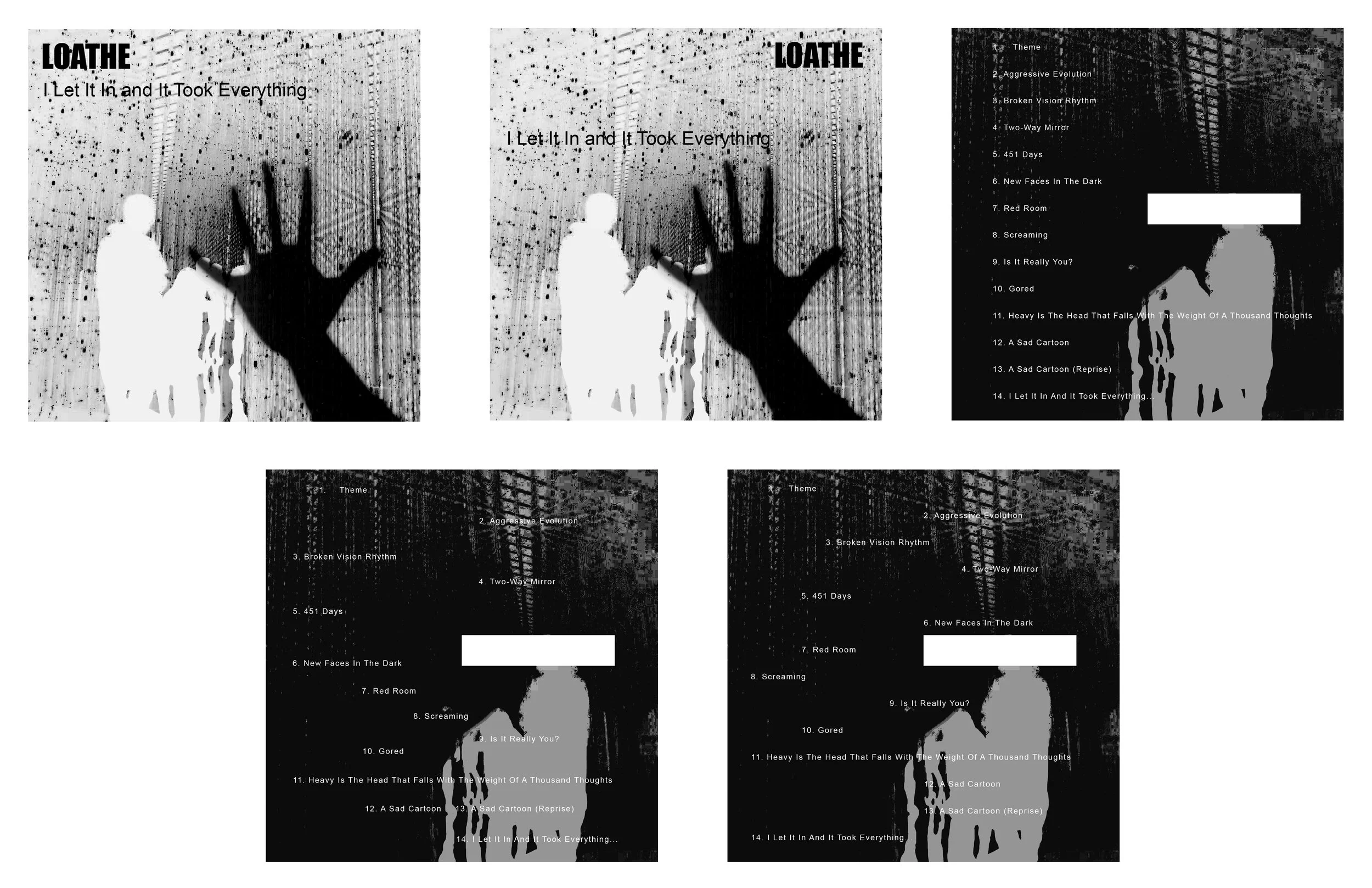
Final